I've somewhat shied away from reviewing nail collections in separate posts since I do a daily NOTD, but I'm happy to make an exception for the OPI Ford Mustang Collection.

I have a confession to make: I've always had a soft spot for Ford Mustangs. I can pinpoint when I fell in love with the classic American muscle car: when I was in high school. I grew up in a town with a university. When I was in high school, I worked at a local establishment part-time, and got to interact with the college students who seemed oh-so-cool to a 16-year-old. One of the coolest of them all was a college guy (who could've been a male model) who owned a Ford Mustang. And there the infatuation with Mustangs began. I've never owned (or even driven) one, but I do love the roar of a Mustang engine. When I ran into the collection at my local Ulta, I was forced into a quick decision. As you can see from the photo, they only received 2 of each shade. Thus, I bought the collection in one fell swoop. It feels right to review them all in one post.

The OPI Ford Mustang Collection ($9 each, 0.5oz, via Ulta and salons) is comprised of six shades: Girls Like Ponies, Race Red, 50 Years of Style, Sky's the Limit, Angel with a Leadfoot, and Queen of the Road.
This wheel is in direct sunshine.
Overall, this is an outstanding collection. I forgot just how wonderful OPI's formula is. I'll get into each shade individually.
Girls Like Ponies
Girls Like Ponies is a saturated hot pink creme. Formula and pigmentation are outstanding; I have two coats plus Sally Hansen Triple Shine topcoat on my nails in this photo. This is probably a dupeable shade in most stashes, but I still find it to be lovely and perfect for summer. I was inspired when I noticed my tree had bloomed:
Although hot pinks are the standard nail color for summer, I find this to be a lovely addition to my stash. It's almost a one-coater.
Race Red
When I first learned of this collection, I knew Race Red would be coming home with me. When I finally saw it in store, it was the first shade that I grabbed from the display. There's something about the shade and its name that sent my heart aflutter. Race Red is the perfect summer red- a flawless tomato red creme that's almost a one-coater. I have two coats plus topcoat on my nails here. It's hard to tell in this photo, but it really is quite orange-leaning. I'll be able to show a better comparison vs Coca-Cola Red (coming soon).
50 Years of Style
50 Years of Style is a shiny metallic gold hue with surprisingly excellent formula. I did need three coats to achieve the desired effect, but brushstrokes were not an issue. For a metallic, this was a lovely surprise. I can see myself playing around with this since I instinctively reach for cremes by default.
Sky's the Limit
Sky's the Limit is a glitter-packed blue with (naturally) the trickiest formula of the bunch. It requires three coats to achieve the color in the bottle, and is a bit of a bear to remove. I initially thought about not purchasing it, but knew I'd be looking for it at a later date to round out the collection.
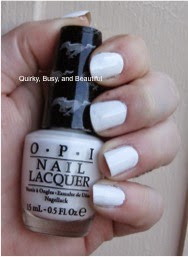
Angel with a Leadfoot
Call it a reaction to the sweltering heat lately, but I've been digging white nails the past few weeks. Angel with a Leadfoot is a lovely white creme, with probably the best formula I've ever seen from a white. There are three coats plus topcoat on my nails in this photo, but it doesn't tell the story. This is buildable and has the best formula I've seen. It self-levels and dries quickly. I could've almost gotten away with two coats, which is unheard of for a white. I highly recommend this shade.
Queen of the Road
Queen of the Road is the shade meant to recall the classic Mustang black. It's not a true black, but rather an ultra-dark grey shimmer. It really looks like the finish on a new car. Like every other shade in the collection, formula was great, needing only two coats to achieve the perfect finish.
Overall, I highly recommend this collection. I've reached for three of the shades more than once already, and can see these classic shades being a part of my rotation for years to come.
Although I loved writing this collection up, I promise that tomorrow's feature will be something other than nails!